

Patrick Osei
Examining how the Ghanaian brand designer uses visual hierarchy, consistency and adaptable communication to build a contemporary conference identity
A successful conference begins communicating long before an audience enters the venue.
Its identity may first appear through a social-media announcement, digital invitation or promotional campaign before expanding into speaker graphics, presentation screens, printed materials, signage and other audience-facing applications.
The challenge for the designer is therefore not simply to create an attractive logo or individual promotional graphic. It is to establish a visual system capable of remaining recognisable across different formats, environments and types of information.
In The Conference Visual Identity, Ghanaian brand designer Patrick Osei explores this challenge through a coordinated identity system built around visual consistency, information hierarchy and adaptability.
THE BRIEF: POSITIONING AN EVENT AS A RECOGNISABLE EXPERIENCE
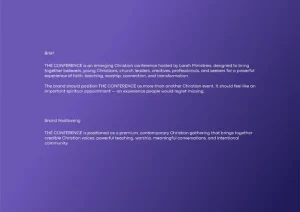
Project brief and brand positioning: the identity is framed as a premium, contemporary Christian gathering designed around faith, teaching, worship, connection and community.
The project begins with a clear strategic intention. Larah Ministries wanted The Conference to feel like more than another event in an already crowded faith calendar. The brand needed to carry a sense of significance: an appointment that audiences would recognise, anticipate and remember.
That premise gives the visual work a useful discipline. The design is not only asked to attract attention; it has to create enough coherence that the conference can become recognisable across repeated encounters.
BUILDING A VISUAL SYSTEM RATHER THAN A SINGLE GRAPHIC
Conference branding presents a particular communication challenge because the identity rarely exists within one fixed format.
The same visual language may need to accommodate an event announcement, a speaker profile, a programme, a presentation screen and environmental graphics while still appearing to belong to the same event.
Osei addresses this by approaching the project as a system rather than a collection of unrelated designs. Across the project, recurring visual elements provide continuity while individual layouts are given enough flexibility to respond to different communication requirements.
What is particularly effective is the sense that the identity has been designed to expand. The individual applications do not appear as isolated experiments. Instead, they share enough typographic and compositional characteristics to establish a clear visual relationship.
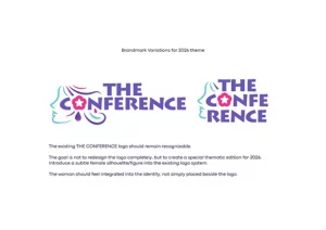
2026 thematic brandmark explorations integrate a female profile into the existing conference wordmark.
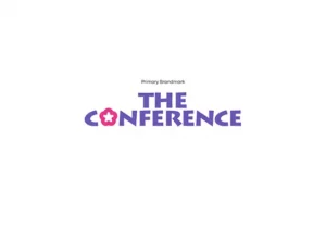
The primary brand mark preserves the established conference name while giving the 2026 edition its own visual signature.
“For a conference identity, the design has to work as a system. Every application should feel connected while still being able to communicate different information.”
— Patrick Osei
A rigid identity system can become repetitive when applied across numerous event materials, while an excessively flexible system can lose recognition. Effective conference branding requires a balance between the two. Osei’s solution is strongest where it creates recognisable rules rather than a single repeated template.
HIERARCHY AS A COMMUNICATION TOOL
One of the strongest aspects of The Conference Visual Identity is its handling of information hierarchy.
Conference communication can quickly become visually crowded. A designer may need to present an event title, speaker name, date, location, programme information and supporting details within a single composition. Osei demonstrates a good understanding of how these different levels of information should compete for attention.
Large typographic elements establish immediate focal points, while secondary information is treated with greater restraint. In the speaker-led artwork, the conference name and theme form the dominant layer, followed by portraits and names, before the eye drops to date, venue and contact information.
The spacing between elements is equally important. Osei avoids allowing every component to demand equal attention, using scale, grouping and negative space to establish a reading sequence that remains legible even when the composition is dense.
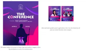
This matters particularly for digital communication, where audiences may encounter an event graphic for only a few seconds on a mobile screen. The central message must register immediately while still allowing supporting details to be found on closer inspection.
CONSISTENCY WITHOUT REPETITION
Another notable strength of the project is the way it maintains consistency without forcing every application into exactly the same composition.
A conference announcement and a speaker introduction may belong to the same event, but they do not communicate the same message. Each therefore requires its own hierarchy and emphasis. Osei’s approach recognises that difference while retaining a shared visual vocabulary.
The connective tissue comes from a controlled palette of deep indigo, violet, electric blue and saturated pink, combined with sweeping curves, gradient fields and recurring geometric forms. These ingredients reappear with enough variation to keep the system lively.
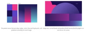
“A visual identity should have structure, but it should not become rigid. Different applications need different solutions while still feeling like part of the same brand.”
— Patrick Osei
The strongest identity systems establish rules that can be recognized without becoming overly predictable. Here, recognition is built through relationships between colour, scale, curved forms and typographic behaviour rather than through exact duplication.
TYPOGRAPHY AND VISUAL CHARACTER
Typography carries a significant share of the personality in the project. Osei pairs the highly expressive Lithos Pro display face with Codec Pro for supporting copy, creating a contrast between a distinctive, sculptural headline voice and a calmer informational voice.
The display typography is especially important to the conference wordmark. Its irregular, carved forms give the identity a recognizable character without relying on ornamental effects around the type. In application, the letterforms are used at scale to create immediate impact, while the supporting type remains comparatively quiet.
This pairing gives the compositions energy without sacrificing readability. More importantly, it creates rhythm: emphatic display forms draw the eye into the page, and simpler supporting type allows dates, names and venue details to remain practical.
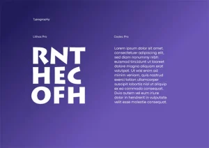
Typography system: Lithos Pro functions as the expressive display voice, while Codec Pro supports longer and smaller informational.
The treatment demonstrates an understanding that conference branding must remain functional. A visual system may be expressive, but if audiences cannot quickly identify speakers, dates or venue information, the communication has failed. Osei largely avoids this problem by allowing visual expression and informational clarity to reinforce one another.
DESIGNING ACROSS MULTIPLE TOUCHPOINTS
One of the clearest tests of an identity system is whether it can survive movement between formats. Modern audiences may first experience a conference on a phone, then encounter the same identity on a printed banner, an attendee badge or a large outdoor display.
Those environments differ significantly in scale, viewing distance and purpose. Osei’s presentation recognises this by moving beyond the hero poster and demonstrating how the same visual language can be translated into practical event applications.
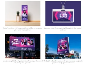
The environmental mock-ups are useful because they expose an important strength of the identity: the high-contrast palette and bold display typography remain visible when the work is scaled dramatically. The repeated curves and blocks also create large visual zones that read from distance before the smaller informational layer is approached.
DESIGN AS PART OF THE EVENT EXPERIENCE
Event identity is often discussed primarily in relation to promotion, but its function extends beyond attracting an audience. Visual communication contributes to how an event is experienced and remembered.
The first announcement establishes expectation. Speaker graphics develop familiarity. Programme materials help audiences navigate information. Badges and environmental graphics reinforce recognition once participants arrive at the venue. In that sense, the visual system becomes a connecting element between different stages of the audience journey.
Seen from this perspective, Osei’s project is not simply concerned with creating promotional graphics. It considers how design can create continuity across repeated encounters with the same event.
INDEPENDENT ASSESSMENT OF THE WORK
The strongest aspect of The Conference Visual Identity is Osei’s ability to treat multiple communication pieces as part of one coherent system. The project demonstrates a clear understanding of the difference between designing an attractive individual graphic and creating an identity capable of supporting repeated communication.
His handling of hierarchy is particularly effective. The contrast between the oversized conference wordmark, carefully grouped portraits and smaller informational details creates a clear order even in the more content-heavy applications. The audience is not asked to process every element at once.
The project also benefits from a disciplined approach to colour and form. Saturated pink and cyan accents sit against darker violet and indigo fields, giving the system enough contrast to feel energetic while the recurring curves soften what could otherwise become a rigid grid of boxes and portraits.
The 2026 logo adaptation is another effective decision. Rather than abandoning the existing conference mark, Osei introduces a female profile and flower-like symbol into the established wordmark language. That choice allows the edition’s theme to influence the identity without erasing continuity with the broader event brand.
There are areas where the project could be pushed further. A more extensive demonstration of stage graphics, wayfinding and complex programme schedules would provide an even more demanding test of the system. It would also be valuable to see how the identity behaves in motion, particularly for social video, speaker introductions and screen transitions.
Those opportunities do not undermine the work. Overall, The Conference Visual Identity is a confident piece of contemporary brand-design practice that demonstrates strength in hierarchy, visual consistency and adaptable communication. Its most convincing quality is not any single decorative feature, but the repeatable logic connecting its many applications.
A DEVELOPING APPROACH TO CONTEMPORARY BRAND DESIGN
The project also provides insight into Osei’s broader approach to visual communication.
His professional experience includes more than three and a half years working as a Brand Designer at StarTech Multimedia Ltd in Ghana, followed by freelance practice and creative contributions in the United Kingdom.
Across this developing body of work, Osei has increasingly focused on the relationship between individual visual assets and wider identity systems. The Conference Visual Identity reflects that progression.
Rather than concentrating exclusively on a logo or single promotional piece, the project considers how a recognisable design language can operate repeatedly while responding to changing content. That approach reflects a broader reality within contemporary branding: audiences encounter identities through social platforms, mobile devices, printed communication, screens, physical spaces and live experiences.
LOOKING AHEAD
For an emerging designer, projects of this kind provide an opportunity to demonstrate thinking beyond isolated visual outputs.
The Conference Visual Identity shows Osei exploring how hierarchy, consistency and adaptability can work together within a wider communication system. Its significance lies not simply in the appearance of individual applications but in the relationships established between them.
The work suggests a designer developing greater confidence in the strategic dimensions of visual identity particularly the need for branding to remain useful, recognisable and flexible as it moves between platforms.
“My goal is to create identities that do more than look good. I want them to communicate, connect with people and work effectively wherever they are experienced.”
— Patrick Osei
Ultimately, the strength of a conference identity is determined by whether audiences can encounter many different pieces of communication while still recognising one coherent visual voice. With The Conference Visual Identity, Patrick Osei demonstrates a considered and increasingly mature approach to creating that coherence through contemporary brand design.
By Justice Kobina Otchere Ackom