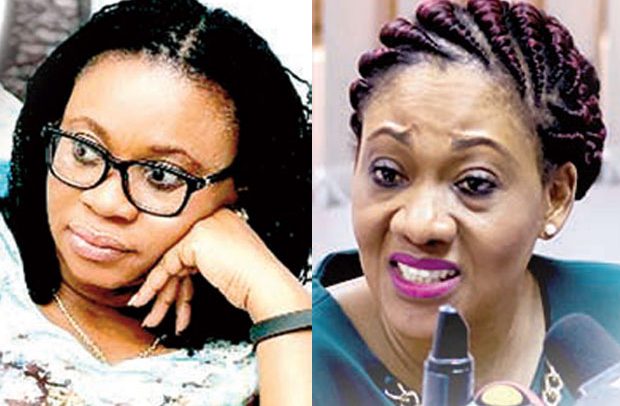
Charlotte Osei and Jean Mensa
The incessant use of the now dropped Charlotte Osei generated Electoral Commission (EC) logo by some media establishments in their graphics has attracted a reminder and correction that the image is no longer in use and should be discarded.
A release from the election management body and signed by its acting Director of Public Affairs, Sylvia Annor, made an observation about “the use of the old logo of the commission when carrying stories on the Electoral Commission.”
The release referred to the 4th December 2018 date on which “the commission unanimously decided to revert to the original logo of the commission” which image the election management body explained “reflects the Coast of Arms of Ghana with a ballot box at the centre. It also depicts a hand casting its vote.”
The commission entreated defaulting media houses to make the necessary amends in future stories.
Controversial Logo
One of the striking actions undertaken by the former EC Chairperson, Charlotte Osei, was the replacement of the age-old logo of the commission, an action which drew heated debate from a cross section of Ghanaians.
She hid behind the independence of the EC and eventually had her way even as Ghanaians had their say.
The logo she came up with resembled an ancient Greek mystical image, with spiky designs feeding converging on a central point.
Many claimed cynically it was a plagiarized work, but it was vehemently denied.
At the time, Mrs. Charlotte Osei rebuffed claims that the commission had plagiarized the logo of a Turkish educational institute, Yedi Sistem, challenging the said institute to assert its rights under the law if indeed it felt there was something wrong.
The then EC chairperson, addressing journalists at the launch of the commission’s strategic plan, had maintained that “we don’t feel we have plagiarized their logo.”
Cynics claimed it represented a mystic sign. Most of the commissioners, it would be recalled, even opposed the change.
During the unveiling of her pet logo, she had passed her infamous remarks, “That is our new logo. We like it, we picked it, and it makes us happy!”
“I don’t think it looks like mine. I like mine better,” the chairperson had said and had pointed out that “it is not just about putting colours together…a logo is not just an artistic competition.”
The EC boss at the time also took the opportunity to explain the commission’s new image which, according to her, was key to its underlined vision.
According to her, the circle as in the new logo, represented unity, ‘singular and unified in its purpose’; the Blue also represented the stability and independence of the commission, and the inward-moving arrows reflected equality.
She had also said that the use of red, gold and green represented the country Ghana, and the whole identity was a unified common purpose and vision that demonstrated the independence of the commission.
By A.R. Gomda

